Tuesday, August 31, 2010

1.2 A little print, a little web, a lot of good

Starting out week one with a look at some very sleek website design seems like the perfect place to begin. The 2Advanced Studios design company has a website that perfectly mirrors their assertion that they “push the boundaries of design and technology.” Every single detail of this site is perfectly designed to promote an edgy, part futuristic, part fantasy-scape image. This extends from the background imagery to the hypnotic music to the titles of the former site versions—Rebirth, Expansions, and Prophecy—located in the web archives.

The navigation system further feeds into this futuristic feel by using an uncluttered bar that drops down upon rollover with a subtle melodic computer processing sound, expanding within itself to a greater or lesser levels of specificity. In fact, every bit of information you could want is accessible from this main page, and yet there is a spacious feeling to the design based largely on the use of dropdowns that keep most of the information organized. Also, the use of background music, while often annoying on many websites, is ingenious in this case. The hypnotic sound actually made me hang around and browse the website (literally all of the sections) for a much longer time period than if I was just clicking around without that sound. It created a sophisticated ambience that fit seamlessly with the rest of the site contents. Also, speaking of seamlessness, 2A managed to use a background with a different color scheme on each main area of the website while making these pages tie in perfectly together. This sounds like an amazing feat, and trust me, it is.

First of all, the website pages are tied together by the consistent placement of frames within the space and the consistent look and function of the main navigation bar as well as the sub-navigation bars revealed in each section. Even the scroll bars fit into the overall design by offering a sleek line that matches the color scheme of each page, but using a common white handle to offer consistency between the pages. Beyond all that, however, they pull off the color changes by exchanging background images that utilize space in a similar fashion; each image has a relatively open sky area to prevent crowding the navigation and a foreground that is fairly dark and free of large objects. Of course, the pyramid that appears in each image also gives them a similar feel. Finally, the color changes work because each one is revealed in the navigation. Scrolling over “company” in the navigation bar reveals a slightly luminous, circular green bullet and clicking the company page loads a dominantly green background. That kind of attention to minuscule details is what makes all the elements of this site gel.

Now, cool animation and elegant design aside, 2A has not skimped on function. Everything is clearly labeled and all elements (portfolio, about page, contact, etc.) are available in the navigation panel on each page. There is not one extra click required on this site—like having to go from “awards” (which a sub-menu of “recognition”), to “home” in order to access “about.” 2A designers also clearly understand that some users will be annoyed by a rollover navigation system or background music, and offer preferences that allow the user to alter these elements and save the changes for later viewing of the site. Even more importantly, the sound and language can be adjusted at the top of the page, so there is no chance a user will have to fumble around looking for those controls under preferences if they just want to quickly change those settings.

I could go on here, but suffice it to say that every element of the 2A website is purposeful and well-designed. The animations are engaging but subtle, the imagery is beautiful and contextually appropriate, and every part of the design seems effortless, which is the true sign of a sophisticated creation.

Check it out here:
http://2advanced.com/#home

Now, since print is still alive and flourishing, I turn my attention to a book. Creating a Website: The Missing Manual is, despite the straightforward (read unimaginative) title, actually a fun book. OK, I know, the book is part of a series so the title is out of Matthew MacDonald's control, but I want to make it clear that this book is not in any way boring, as the title might suggest. It is extremely informative but written in a pleasant, conversational style. This is important because it achieves the nearly impossible task of presenting technical material in a way that is neither insulting simplistic (like the "For Dummies" materials) nor boring beyond belief. In addition to the book, there is a useful companion website; this is somewhat surprising because it functions as more than a promotional page and set of testimonials. The website has links (all of which are actually functional and up-to-date) and downloadable materials that relate to every chapter. It, as well as the book, is definitely worth a look.

Check it out here:
http://missingmanuals.com/cds/creatingws2tmm/

And in print:

Saturday, August 28, 2010

1.1 Instructional graphics—More of the same (only different)

This week I have started my third semester as an MLIS student at the University of South Florida and among other courses, I am taking LIS 5315—a.k.a. Instructional Graphics. This presents an excellent and unexpected opportunity because a major course requirement is to keep a weekly blog about design as related to websites, books, and articles we are reviewing in the course. Enter my somewhat under-utilized blog, Writing-It-All-Down. As luck would have it, I already talk about my favorite topics—art and design—in this forum, and now I will have some external motivation to post here on an extremely regular basis. I am looking forward to delving deeper into the concepts behind excellent design and to engaging in some fierce critique of web resources—I am almost getting nostalgic for my MFA weekly critique days just thinking about it… And by the way, critique is best suited to a dialogue so please feel free to comment often and on whatever interests you. If you want to closely track my class progress as I work through web design challenges and opportunities just check out the handily labeled posts—1.1, 1.2, 2.2, and so forth (the first number relays the week of the semester, the second number charts the frequency of posts related to a particular set of weekly topics).

So, here’s to good design, honest commentary, and a great semester.

Wednesday, August 11, 2010

Simplicity?

Complexity and simplicity are completely intertwined. We often surround ourselves with more and more items that we find engaging, cram more moving gadgets onto a web page, or add layer upon layer of graphics into a page design. “Stuff” is engaging, and it sometimes looks cool—but then what a relief to see something that is pared down to its basic elements. A hotel room is a beautiful respite from home precisely because it lacks all the clutter of overdone décor. Space between items on a page lets us really process a clear, crisp message. The question, raised by John Maeda in his Laws of Simplicity, is how much can you remove before something no longer functions—or engages? And that is what makes simplicity so complex. Paring down requires careful revision; every included element must ooze purpose. Working with less has the potential to expose flaws, but when done well, it creates captivating design.

Check out John Maeda, Head of the Rhode Island School of Design, on TED:


And check out his blog for a simplified version of his book, The Laws of Simplicity:
http://lawsofsimplicity.com/

The bottom line, creating simplicity in design requires vision, thought, and sometimes genius. And that, in itself, is complex.

Thursday, August 5, 2010

What defines beauty?

I watched a short lecture today by a medical illustrator in which he discussed the beauty of the workings of cellular structure. This got me thinking about a friend in graduate school that began working with a scientific institute on campus to view magnified views of her blood cells and other medical imaging processes. The results were undeniably beautiful and as she got more and more invested in the medical imaging the works she was creating became less and less manipulated until finally a 3-D model of her lungs was sufficient to represent her vision. It was a fascination with the ability to see the body in this new way that took over, and in many ways eclipsed the inspiration part of using the works to create something else. The imaging became the work, the art was in the gesture.

The medical institute was ecstatic to be collaborating with an artist. We were all seduced by the products of this partnership. At one point, though, a professor rightly asked the student whether there wasn't a vested interest on the part of "science" in seeing its developments and technologies as an art unto themselves. Wasn't she just a tool in a broader attempt to promote the imaging as art in its own right, as science as something beautiful and pure and truthful? And really, the imaging created a beautiful concept that was devoid of some of what art is about. There was no challenge there, just beautiful, pure "truth." Something of a dangerous, seductive concept. Anyway, the allure of imaging technology is still there, as a tool and as something more. The video below illustrates just that.

Tuesday, August 3, 2010

Sustainable architecture in the sand

I came across a video on Ted.com today that deals with using bacteria to create architecture in the sand. Quite literally, the sand is transformed into sandstone that is both a rigid and inhabitable structure; it combats desertification processes as well.


The fact that such ingenious ideas are out there, and possible today, gives me hope that we might be able to create a more sustainable way of living sometime soon. This is one of the most heartening things I have seen in a while. We really are capable of doing better...

Monday, June 14, 2010

Hmmm, design by the people...

SmugMug is a website that is a fascinating mixture of beauty and chaos. It is a professional photo and video hosting site that allows users to select from lovely preloaded web designs to showcase their imagery on personal web pages; it also allows certain tiers of users to customize their own pages. This is essential for SmugMug's marketing of course, but it is always amazing to see the train wreck that results from some individuals' forays into design. Creative people can be some of the biggest offenders, and I have to say, some of the resulting web pages are an utter assault to my eyes. I can't fathom purchasing the featured photographs because I can't focus on them long enough to decide if they are any good; instead my view oscillates between a riot of colors and shapes from the images and the competing backgrounds.

For instance, user photographyshed (http://photographyshed.smugmug.com/) has a basic background of dark gray and black with white and neon green text. Most of the individual galleries and sub-galleries use this same scheme. However, clicking on “cars” yields a bright red background, and worse, clicking on “children” yields a beige striped background with graphic toys in baby blue running across the top of the page. These two galleries break any continuity with this user’s main pages, and are hard to look at both individually and in the context of the whole.

Why am focused on this issue of continuity? Because simplicity and clean design demands that pages relate, that some element of color, font, or pattern unites. Photographyshed offers just one example among many that proves that just because you can do something (like pick themed backgrounds) doesn't mean you should.

And while we are on the subject of what you shouldn't do, I can't tell you how many professional photographers have downright forgotten how to look at what they are shooting. Yes, cropping out body parts in a portrait can be done artfully; but really, when did it become acceptable to crop at the ankles or cut off the toes? I think this is an issue with digital technology (which I am in no way berating here) because photographers are so sure they can fix anything in postproduction. They are losing the details because they are forgetting to look. This site offers a flood of beautiful imagery, but much of that beauty is placed right next to mediocrity. This website offers both the best of commercial photography, and the worst amateur mistakes imaginable. And I have to say, the proximity of beauty and mediocrity is in itself somehow both riveting and maddening, and beyond worth perusing. I suppose the poetry of the Internet is indeed that everyone has a more or less equal voice (at least right now), no matter how hideous or elegant their vision may be.

Check out SmugMug here:
http://www.smugmug.com/photos/best-photo-sharing/

Friday, April 30, 2010

Photographic memories

I've been thinking a lot about preservation lately as I have been studying the conservation of artifacts and the issues that arise with regards to saving the past. This got me thinking about the mountain of photographs I uncovered two years ago when I was helping to clean out my grandmother's house before she moved to a smaller setting. The images didn't have any real value to her--they were in a giant pile--and yet upon looking through them she had lots to say.


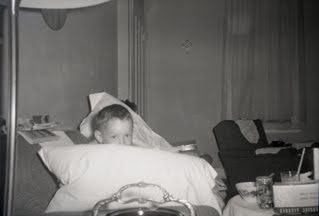
Included in the bunch were hundreds of photographs that my father took with his very first Kodak camera. They are fascinating views of his family and neighborhood, all through the fresh vantage point of a child; this a viewpoint that no adults can ever really replicate.  As I was thinking about the question of value with regards to documents, it occurred to me that these images have way more than sentimental value, they have historical value too. The clothes and people are a record of that time and place. The houses, cars, and other ephemeral items really are a testament to how people used to live. And more than that, the images record fleeting moments that would otherwise be lost.

I have not organized this massive image archive to date (I usually get distracted by the content when looking through them); however I did decide to start by scanning a set of my father's early negatives. Below is a small sampling of that effort, which ultimately goes a long way to preserving a little piece of my family's past.


Wednesday, April 14, 2010

Lists and memories

The Smithsonian Archives has an exhibition on display right now that has really touched me in an interesting and unexpected way. Lists: To-dos, Illustrated Inventories, Collected Thoughts and Other Artists' Enumerations from the Archives of American Art is exactly as it sounds: a display of some of the lists contained in the Archives. And of course they are beautiful documents, so that is enough of a reason to show them. However, I find myself drawn to them for another, perhaps subtler reason: I too am a list-maker; but it is more than that simple act of creating a list as a memory aid for immediate tasks. What compels people to save those documents? There is a reason that hundreds of thousands of these pieces have made it into the Archives collections. They serve as a reminder of a specific point in time; they give you--and eventually others--a glimpse into your mind. There is something comforting about looking them over as reminders of the past; of accomplishments or failures.

I found this out as I was clearing the Post-It notes from my desk one day. As I was removing the immaculately ordered and executed reminders, I found that it seemed wrong to simply throw them away. Instead I carefully collected them, along with other bits of paper where I had jotted notes or reminders, and placed them in a notebook. It somehow seemed wrong to do anything else. 

People collect many things, but I have found a fond kinship with those that collect their scribblings as a way to document their lives. It is amazing to find that a simple note can be as telling and emotional as a photograph when examined within the context of a person's life. That is what moves me most about the Archives exhibition, that it is a window into the lives of these people.  


   To-do list, August 16, 1961 by Eero Saarinen. Aline and Eero Saarinen papers, 1906-1977. Archives of American Art, Smithsonian Institution.

Saturday, March 27, 2010

Everything that moves in Florida is poisonous...


The temperature has finally begun to warm up and there is a sudden explosion of colors outside where only days ago everything was a different shade of neutral.  I took a walk on a wooded trail a few days ago, just to get some time away from my apartment and away from the weight of too many final projects.


As always, I chose a wide trail—I like to view nature from a little bit of a distance, or more accurately, from a vantage point where nothing actually brushes against me. Yes, I am squeamish and I am from the Northeast where the things you find outside are less likely to be poisonous.  In fact, I am certain I saw a black widow spider in the exterior hallway of my apartment complex the other day and I've been thinking about it ever since.  On my walk, I saw the interesting—and gargantuan—insect pictured above sunning himself on a leaf.  I immediately took some photographs and pointed it out to my boyfriend, who burst my bubble by saying it was "one of those bugs that spits in your eye." As I said before, poison, poison, everywhere... But before I made haste back to the interior sanctuary of my apartment I did manage to find a little beauty in the natural world.


Tuesday, March 16, 2010

Wedding archive

This weekend I was finally transferring files from my last laptop—a Macbook Pro with a casing cracked so badly that the wires are exposed—to a new portable hard drive. (I will tackle the old desktop unit next, but I need a break.) As these things always go, I spent an inordinate amount of time looking through all those impeccably organized folders. I know what is there, and more or less where to find what I need, but I still relish the opportunity to study old images with the excuse that I will be a more productive person at the end of the process... it's more or less true.

Reminiscing aside, the point is that I revisited the pictures I took at my cousin Rene's wedding last year. It took place in early January in Upstate New York—and if you've ever been there in winter you know what I'm about to say—it was unbearably cold. Anyway, I spent several days, upon request from my aunt, shooting images at parties, rehearsals, and the reception. It was entertaining enough, but served as a great reminder why I don't, as everyone always asks me, "just shoot weddings." I had my aunt hire another photographer for the ceremony and all the posed, requisite shots of the bride with mother-in-law, bride with bridesmaids, groom with parents, guests standing behind their tables, bride-and-groom-kissing, and, well, you get my point. Instead, I just got to hang out with my camera and shoot whatever seemed interesting, without having to know who the groom's fourth cousin was, and why she needed to be included in a shot with his great-grandmother, sister, and second cousin... I left that stressful mess to the other photographer for sure.

Anyway, following is a selection of 20 of my favorite shots.


Monday, March 8, 2010

Writing it all down

So, hello anyone out there...

I took my inspiration for this first post from my friend Krista. She has been blogging about her life and design business for quite some time, and I thought it was about time to try it out myself. We both went to art school, and both recently left jobs that were stifling us to pursue something a little different. For her, that has been devoting all her time to her clothing line, which she produces herself and sells on the indie fashion circuit. For me, it has been returning to school to pursue another graduate degree.


That said, I miss producing art, which I used to do quite prolifically, and I miss writing about things outside an academic setting; it has been awhile since I really made anything for myself. My friend Christina has been suggesting that we procure a residency and work on a couple of collaborative projects, like we used to do in graduate school. It's a good idea, and one that I have been putting off for a few years now, mostly because work has taken precedence in my life for quite some time (and all my creative design work has been focused in that direction). In the interest of making time to create things, I am going to begin by posting something here each week. Eventually (maybe this summer) I will make time to work on those collective projects.

So, why should anyone out there care about any of this? I'm not really sure they should, however, this is the first step to reclaiming my time and redirecting my efforts; making it public is what will hold me to it. Here's to writing it all down... or at least some of it anyway.